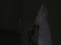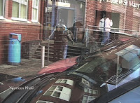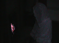
Our sequence has elements within it that can be related to a ‘thriller’, the narrative and characters are typical of this genre. A villain (the psychopathic mother), a victim (the daughter) and a plot to kill are all evident in this sequence. The typical props used, for instance, the way in which we decided to use the photo frame shows how abnormal and warped the mothers mind has become and the use of a 'petrol can' and 'matches', alongside the use of low angles illustrate the twisted and violent side to a thriller, they imply death. We deliberately used typical media language such as dark and dismal low key lighting, tense and reflective music to aid the fact that it is a ‘thriller’. Although our sequence needed these typical elements to establish that it belonged to this genre it needed to be different and to stand out from the crowd because if it replicated other ‘thrillers’ our audience would get bored of recurrence. In order to avoid this we came up with a narrative centred on ‘honour killing’ and the westernisation of the youth from a traditional Eastern background, there are no media products on ‘honour killings’ other than those shown on the news. Honour killing is prominent in the Asian community and affects many lives: our innovations will prove to be an insight into this horrific but true happening. This was shown as the majority of our audience found our plot gripping and exciting as it is based on events that prop up in the British News.


Our media product represents such social groups: - men and women, young people through their appearance and the media language. Firstly the men and women are represented through traditional eastern views on culture; men and women are not to mix unless they are family. To create this traditional image of the mother in the sequence we had to use a suitable costume; her conventional clothing shows she is still in touch with her background and is not prepared to give it up although she is from the East. Her actions (setting her daughter alight) show she has a backward mind as she cannot accept her daughter in a relationship and is not willing to give up her beliefs. This view of Eastern women with traditional views is stereotypical yet the fact that she engages in such violent and gruesome acts challenges the stereotypical view of women in the media as they are commonly seen as tender and loving. The reason why we decided to challenge this view on women was to show how distraught and upset the mother is by her daughters acts of indiscretion and our audiences response was positive as they thought her role bought a gripping edge to the sequence. Secondly, to represent young people from an eastern background who are westernised, their costumes and appearance adhere to their surroundings, not traditional but modern English yet the daughters headscarf shows her innocence and respect for her culture and religion. The daughter and her boyfriend are socialising in the sequence, stereotypical of young people as they are shown as happy , in love and innocent, this can be seen through the use of slow motion transition and bright colours in the scenes with the daughter and her boyfriend.


Our movie product although quite original has prominent aspects that link to big British hits such as, ‘Bend it Like Beckham’ and ‘East is east’. The sequence reflects and is based upon honour killing a fairly interesting topic that resurfaces every now and then in British News. Our target audience would be of 16 years and over, the topic is unsuitable to view for people under that age as it displays scenes of violence. The Asian teenage community can associate themselves with the idea that westernisation plays a huge and important part in their lives, they experience the ‘culture clash’ so this society would be our target. Our fan base would be basically the whole of the Asian society in Britain, although this is a small population, it is an interesting topic and thriller lovers should help pool in more viewers. Evident themes such as revenge and love would appeal to wider audiences.
We used media language, mainly lighting to create a sense of time and emotion. The past was represented in flashbacks; the shots were slowed down to illustrate that these events had taken place in the past and to show that the mother was looking over her memory. The lighting in the clip made everything/ everyone looks bright and cheery, suggesting that the past was a happy time. The lighting in the present was naturally sourced yet gave the shots a dark edge, signifying that the mother was depressed and is going through a tough time.


Technology played an important part in both helping to make our sequence and to research on it. The camera work to film the sequence was quite tricky, as we had to consider the rule of thirds and 180degree rule. Using the DTP software to create the project allowed us to select the shots we wanted so we could get the best effect. Learning to use the software was hard at first but once familiar with it, it was really swift and easy to create a sequence that we thought would be powerful, it allowed us to use transitions, such as ’flash/burn’ which was great for our flashback effect. When researching for our project, we mainly used the internet, this allowed me to use such sites as ‘Blogger.com’, this site was interesting as I had to post not only blogs but embed videos, which was really difficult for me to understand but practice makes progress. The technology we used for getting the audience feedback was Microsoft Word, we created a questionnaire that was handed out to the students from the class, and they wrote their opinions down on our sequence.
Looking back at my preliminary task i feel as though our final product was of better quality, the whole narrative was more enhanced; it had a deeper meaning to it, which was inevitable. The shots we used were more varied in the main product, we had: - close-ups (of lit match), low angles (looking up at mothers face when lighting match), tracking shots (following the footsteps), panning shots (daughter and boyfriend walking through car park in college), medium shots (mother walking toward mantel). I also felt we managed to use colour more effectively to show the state of mind the characters are in. The shots with the distraught mother in them were grey, this shows she was angry and cold-hearted yet the shots with the daughter in them were colourful to show how happy she is.
Overall i believe our product was really quite poignant, it had qualities that created a sympathy in the viewer towards the daughter such as clips of her when she young and innocent. The idea of having honour killing as a theme was quite original, and the music “adds to the mystery” (audience feedback) and also helped express the narrative and went well with the genre we were aiming at expressing. However i feel as though we could have made the relationship between the characters clearer. Most of our audience was unable to grasp that aspect between what was supposed to be mother and daughter and were also unable to fully understand why the mother was going to burn her daughter alive.


